> ## Documentation Index
> Fetch the complete documentation index at: https://docs.researchanddesire.com/llms.txt
> Use this file to discover all available pages before exploring further.

# Contributing to Documentation

> Learn how to contribute to the OSSM documentation using Mintlify, MDX, and React snippets

# Contributing to Documentation

The OSSM documentation is built with [Mintlify](https://www.mintlify.com/docs), a modern documentation platform that makes it easy to create beautiful, interactive docs.

<Info>
  All changes to the `Documentation/ossm` directory are automatically deployed to [https://www.researchanddesire.com/ossm](https://www.researchanddesire.com/ossm) after merging to the main branch.
</Info>

## Documentation Platform

This documentation uses **Mintlify** for rendering and deployment. For detailed information about available components, formatting options, and best practices, visit the official Mintlify documentation:

<Card title="Mintlify Documentation" icon="book" href="https://www.mintlify.com/docs">
  Complete guide to Mintlify features, components, and configuration
</Card>

## Local Development Setup

To preview documentation changes locally before submitting a pull request:

<Steps>
  <Step title="Navigate to the Documentation directory">
    ```bash theme={null}
    cd Documentation
    ```
  </Step>

  <Step title="Install dependencies">
    ```bash theme={null}
    pnpm i
    ```
  </Step>

  <Step title="Start the local preview server">
    ```bash theme={null}
    pnpm mint
    ```

    This starts a local development server with hot-reload enabled.
  </Step>

  <Step title="View the preview">
    Open your browser and navigate to:

    ```
    http://localhost:3333
    ```

    <Check>
      The preview updates automatically as you edit MDX files.
    </Check>
  </Step>
</Steps>

<Warning>
  The Mintlify web editor is **not available** for this project. All editing must be done locally using your preferred text editor.
</Warning>

### Local Preview

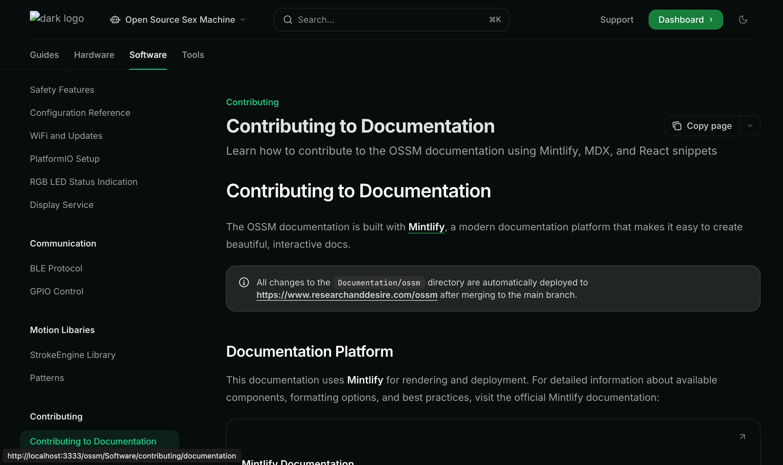
Once you have the local server running, you'll see the full documentation site with navigation, search, and all Mintlify features:

<img src="https://mintcdn.com/researchanddesire/DpcZ0FtUnfloCwJn/ossm/Software/contributing/_images/local-preview.webp?fit=max&auto=format&n=DpcZ0FtUnfloCwJn&q=85&s=7b4d9fad6b05770b2d38f7349e262d7e" alt="Local documentation preview" width="2516" height="1494" data-path="ossm/Software/contributing/_images/local-preview.webp" />

The preview includes the complete navigation sidebar, showing all sections including the new "Contributing" section under the Software tab.

## Writing Documentation

### MDX Format

All documentation pages use **MDX** (Markdown + JSX), which allows you to combine standard Markdown with React components for rich, interactive content.

**Example MDX structure:**

```mdx theme={null}
---
title: "Page Title"
description: "Brief description for SEO and previews"
---

# Main Heading

Regular Markdown content works here.

<Info>
You can use Mintlify components like this.
</Info>

## Another Section

More content here...
```

### Image Guidelines

Images should be **co-located** with the documentation that uses them:

<CodeGroup>
  ```plaintext Structure theme={null}
  ossm/Software/communication/
  ├── ble.mdx
  ├── gpio.mdx
  └── _images/
      ├── ble-diagram.png
      └── gpio-pinout.jpg
  ```
</CodeGroup>

<Tip>
  Don't worry about image optimization—images are automatically optimized during the deployment process.
</Tip>

## React Snippets

For interactive examples and demonstrations, you can embed React components using the snippet system.

### Snippet Location

All React snippets are stored in:

```
Documentation/snippets/ossm/
```

### Snippet Requirements

<AccordionGroup>
  <Accordion title="Pure React Only" icon="react">
    Snippets must use **pure React** with no external frameworks or build tools. The React version is provided by the Mintlify runtime.

    ```jsx theme={null}
    // ✅ Good - Pure React
    import { useState } from 'react';

    export const Counter = () => {
      const [count, setCount] = useState(0);
      return <button onClick={() => setCount(count + 1)}>Count: {count}</button>;
    };
    ```

    ```jsx theme={null}
    // ❌ Bad - External dependencies
    import { useQuery } from 'react-query';
    import axios from 'axios';
    ```
  </Accordion>

  <Accordion title="TailwindCSS Styling" icon="palette">
    **TailwindCSS** is included and ready to use for styling. No additional CSS imports needed.

    ```jsx theme={null}
    export const StyledComponent = () => {
      return (
        <div className="p-4 bg-gray-100 rounded-lg shadow-md">
          <h2 className="text-xl font-bold text-gray-800">Hello</h2>
          <p className="mt-2 text-gray-600">Styled with Tailwind</p>
        </div>
      );
    };
    ```
  </Accordion>

  <Accordion title="Single Export Rule" icon="code">
    Each snippet file must have **exactly one** export or declared function. Multiple exports are not supported.

    ```jsx theme={null}
    // ✅ Good - Single export
    export const MyComponent = () => {
      return <div>Content</div>;
    };
    ```

    ```jsx theme={null}
    // ❌ Bad - Multiple exports
    export const ComponentA = () => <div>A</div>;
    export const ComponentB = () => <div>B</div>;
    ```
  </Accordion>
</AccordionGroup>

### Example Snippet

Here's a complete example showing the proper structure:

<CodeGroup>
  ```jsx snippets/ossm/example-snippet.jsx theme={null}
  import { useState } from 'react';

  export const ExampleSnippet = () => {
    const [isActive, setIsActive] = useState(false);

    return (
      <div className="p-6 bg-gradient-to-r from-blue-50 to-purple-50 rounded-xl">
        <h3 className="text-2xl font-bold text-gray-800 mb-4">
          Interactive Example
        </h3>
        <button
          onClick={() => setIsActive(!isActive)}
          className={`px-4 py-2 rounded-lg font-medium transition-colors ${
            isActive
              ? 'bg-green-500 text-white'
              : 'bg-gray-200 text-gray-700'
          }`}
        >
          {isActive ? 'Active' : 'Inactive'}
        </button>
        {isActive && (
          <p className="mt-4 text-gray-600">
            The component is now active!
          </p>
        )}
      </div>
    );
  };
  ```

  ```mdx Usage in documentation theme={null}
  import ExampleSnippet from '/snippets/ossm/example-snippet.jsx';

  <ExampleSnippet />
  ```
</CodeGroup>

## Development Tools

<Card title="Cursor Rules Included" icon="wand-magic-sparkles">
  This project includes Cursor AI rules to help you follow documentation best practices automatically while editing.
</Card>

## Next Steps

<CardGroup cols={2}>
  <Card title="Mintlify Components" icon="puzzle-piece" href="https://www.mintlify.com/docs/components/accordions">
    Explore available components for creating rich documentation
  </Card>

  <Card title="How to Contribute" icon="code-pull-request" href="/ossm/guides/contributing/how-to-become-a-contributor">
    Learn the full contribution workflow for OSSM
  </Card>

  <Card title="BLE Protocol Docs" icon="file-code" href="/ossm/Software/communication/ble">
    Example of well-structured technical documentation
  </Card>

  <Card title="Forking Guide" icon="code-fork" href="/ossm/guides/contributing/forking">
    Set up your own copy of the repository to work on
  </Card>
</CardGroup>
